
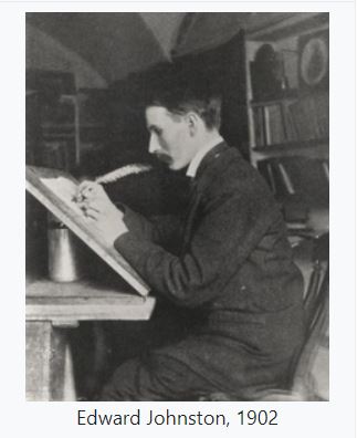
A new typeface (font) was commissioned by the commercial manager (Frank Pick) of the Underground Electric Railways Company of London (predecessor to the Transport for London), in 1913, to standardise and strengthen the company’s corporate identity. The commission was given to Edward Johnston, a Uruguayan-born calligrapher.
Edward Johnston was asked to produce a typeface that would ensure that the Underground’s posters would not be mistaken for advertisements, and it was also to have bold simplicity.
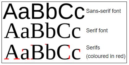
A sans-serif typeface was chosen as the best suited to transport use because of its simplicity and minimalism. A sans-serif typeface is one that does not have extending features called “serifs” at the end of strokes as shown to the right.
Johnston created a font with more rounded shapes than had traditionally been used at the time. Some unique aspects of the alphabet include:
- the letter ‘O’ which is a nearly perfect circle,
- ‘M’ has straight sides,
- the lower case ‘i’ and ‘j’ have diagonally-placed square dots

(which is sometimes repeated in the full stop, commas, apostrophes and other punctuation marks).
Modifications, reworkings and variants of the Johnston Font have been made over the years, but the original basis of the Johnston typeface has been the corporate font of public transport in London since 1913, making its use one of the world’s longest-lasting examples of corporate branding.